Using Google Trends for competitive intelligence
Google Trends is a web application by Google that processes the volume of search results passing through its search engine daily, and produces a series of graphs that gauge general interest in a given search term over a period of time.
Using Google Trends is easy: Enter a search term you’re interested in, and the application will pull up the relevant data for you to browse. You can also choose to look at more than one search term by entering another field.
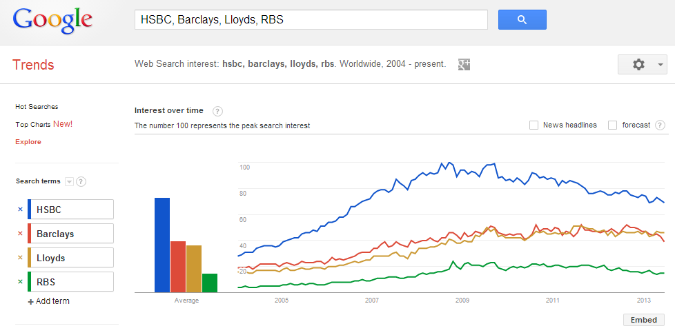
Each result is colour-coded, so there’s little difficulty in digesting multiple layers of information and comparing them against one another. It’s also possible to specify the timeframe you’d like to see the results in as well as the region.
The interface is simplistic, and the results are shown in four panels with interactive graphs that you can manipulate to some degree. A line graph occupies the main panel, showing the volume of searches conducted within a chosen period. It does not offer the exact amount of searches, however; the number is always capped at 100 (percent) and it’s only meant to display the relative interest in a given subject. In this case, a hundred could mean the equivalent of headline news in the offline world.
Any decent line graph will undoubtedly feature spikes, and this is no different. Fortunately, Google Trends has included a helpful feature that punctuates the more significant shifts with relevant news articles procured from its archive, which lends context to the change.
Accompanying the line graph is a smaller bar graph just beside it, showing the average search volume for a given term. The graph itself has little point when looking at just one phrase, but its usefulness rises significantly when more phrases are entered and compared, revealing the search terms that are more popular than the others. The beauty of it is that it does not concern itself with spikes in interest; for the bar graph, constant is better.
There is also a regional interest diagram, showing a map of the world with varying hues of a set colour to signify interest by country. The more saturated the colour, the more interested a given country is of a search term. Finally, a related terms chart sits on the lower right panel, displaying search terms that can oftentimes be more specific on what people are looking for on Google.
It’s easy to see how Google Trends can serve as a simple but effective tool for gauging public interest, be it a product, service or brand. Multiple products from different companies can be examined together to reveal their order of importance in people’s perceptions. Perhaps your product sits in second place relative to your competitors? It may be a signal to improve in the marketing department. On the other hand, a recent interest spike may garner more attention to your upcoming product, which could mean better sales on release.
Google Trends can also be used to monitor audience interest in a niche, and the relevant news reports feature can be a significant help in this regard. A resurgence of interest could mean a promising new product and revenue stream, for instance.
Google Trends is free to use, and it taps directly into the largest search engine on the internet. It does have its downsides – there are no exact search numbers and more references to news articles would be welcomed – but in the end, the application is a highly useful tool in the competitive intelligence toolbox.
Need a quote for competitor research?